Team
Me (designer), 1 PM, Kindle Engineering Team
Timeline
April 2022 - October 2022
Background
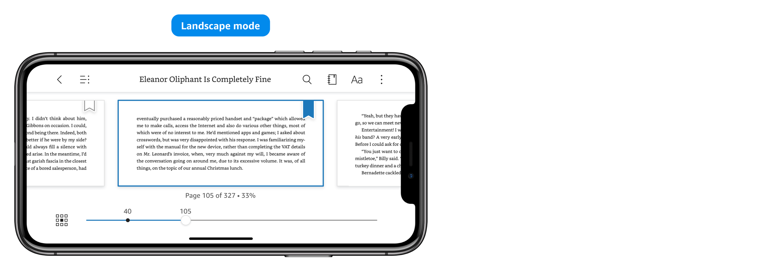
When I first took ownership of Kindle’s core in-book experience, I was given a task to refresh the chrome UI (the view in the image below, where we show a lot of reading features). I recreated all the icons to make them look more cohesive and made sure they meet the tap target requirement. I reduced redundancy in UI elements. Additionally, I redesigned the overflow menu (the 3-dot icon on the top right corner). Customers love seeing their book cover in the new overflow menu. They also like the explicit explanation for some reading features.

The problem
The in-book UI refresh was an overall success, however, our team identified a noticeable problem with the bookmark feature. In the Kindle app, when customers bookmark a page, it will be saved to their annotation notebook. But we observed a huge discrepancy between the bookmark usage and the notebook usage. The bookmark feature on top chrome has 15-17% usage, while the annotation notebook has only 1-2% usage, which indicates that many customers have trouble finding their saved bookmarks.
Deepening understanding of the customer problem
I conducted a preliminary user research to deepen understanding of the customer problem. In the unmoderated research, I started with warm-up questions about participants’ favorite genres and their overall annotation experience with both digital and physical books. Then I dove deep into questions about why and how they use bookmarks when reading. After that, participants walked through their experience using the old Kindle bookmark feature, shared important insights on their expectations, and provided helpful input on areas of improvements.
Through the 8 usability studies, I found out that participants tended to bookmark either for annotation purpose (to review important pages later) or for navigation purpose (to mark the last page they read). Some participants did both. When walking through the old bookmark experience in the Kindle app, overall, it was easier for participants to bookmark a page than to find the bookmark later, which validated the quantitative data the team observed (15-17% bookmark usage, 1-2% annotation notebook usage). Participants tended to open the overflow menu (the 3-dot icon) to find their bookmarks. I also identified the following UX problems:

Design goals
Improve discoverability and ease of use of the bookmark feature.
Help customers easily find their bookmarks.
Simplify the over-crowded top chrome.
Timeline

Usability studies
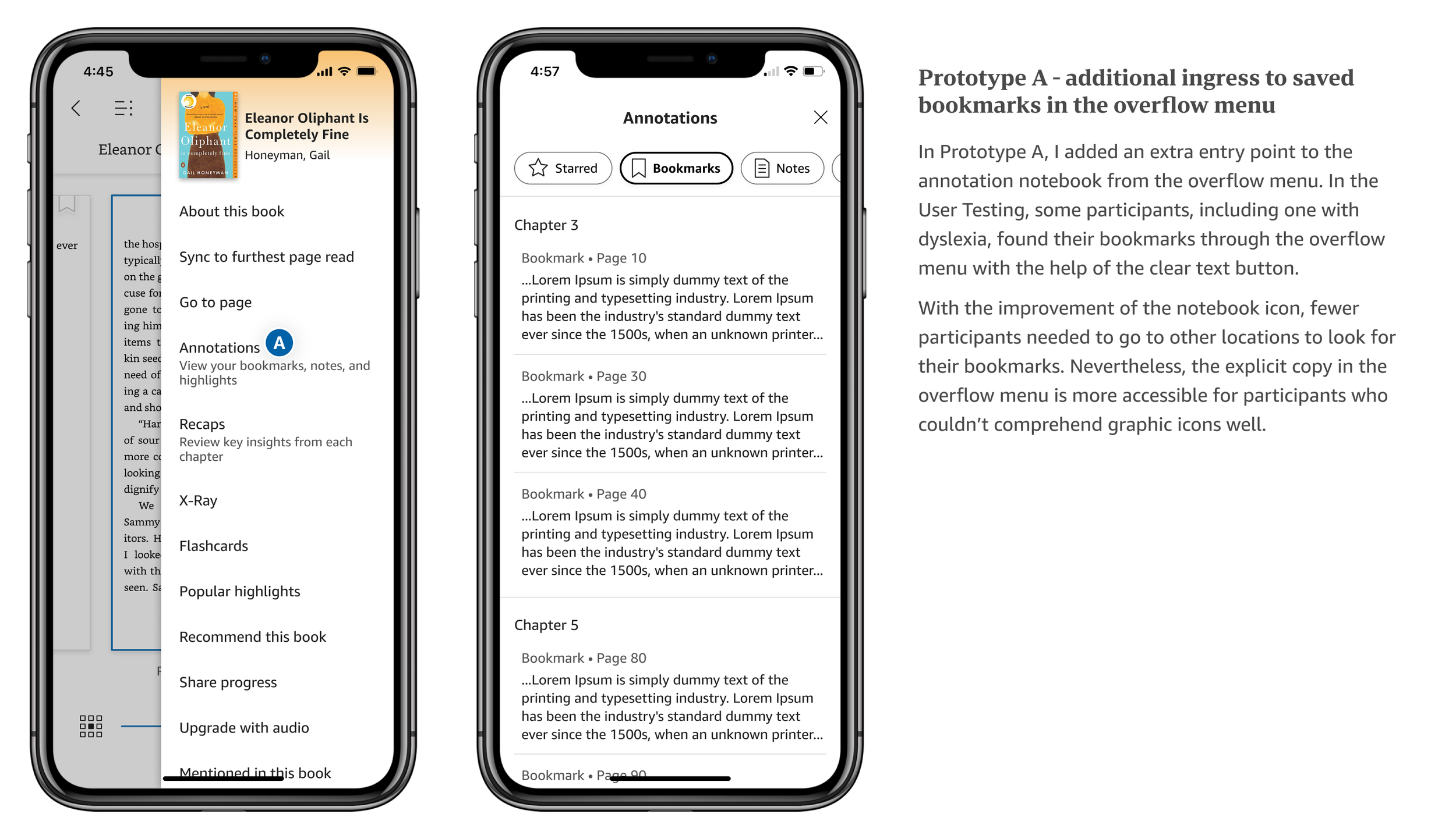
In the previous user research on the old bookmark experience, participants showed tendency of finding their bookmarks in the overflow menu and Table of Contents (TOC). Hence, I wanted to test out two designs that had bookmarks saved in those two different locations (in addition to the original annotation notebook location, which is well known and frequently used by power users).
I launched usability studies with 20 participants through User Testing - At first, I let 10 participants compare the old bookmark experience with one of the new prototypes in order to validate the overall UX improvements. After that, to clearly compare the two new prototypes and find a winner design, I launched another 10 usability studies to let participants directly compare the two new prototypes (without comparing with the old experience).


Overall, participants showed preference over Prototype A. They liked its intuitive discoverability, ease of use, and the capability of organizing all annotations in one place. Here are some participant quotes from the usability studies:
“So the Bookmark icon is not on top. It’s on the pages. Yeah, that’s more convenient. The old one looked like a save or collection page, not a bookmark.” - Participant comparing the old and new bookmark feature
“I’m a fan of what you’re changing, I especially like the new icon for the notebook. I think that’s brilliant to include the little bookmark. Brilliant. Like to have the visual association the way the bookmark looks on the notebook versus the way the bookmark looks on the page, golden, love it.” - Participant talking about the new annotation notebook icon
“I was able to find them (bookmarks) quite easily (from the overflow menu). It turns out there’s even an easier way to find bookmarks (referring to tapping on the notebook icon directly).” - This participant found the bookmarks from the overflow menu first, then she was pleased to discover the new annotation notebook icon
“This time I’m gonna try something different. I can see the right hand, it looks like a bookmark (referring to the new notebook icon). Then I press this. Oh it does have bookmarks! And that’s even easier! I think this is annotations, bookmarks all together, so that’s very convenient... Normally I press the lines button on the top left (referring to TOC button). However, I saw another icon that looked like you had a bookmark on top of it, so I decided to press it. And it just has all the bookmarks and annotations all in one place, which I think is really helpful and it’s just easier to see all the things in one page, which people group those things together anyway.” - This participant found their bookmarks in TOC first, then in annotation notebook
Design details
After validating the new design direction, I iterated and polished the design before engineering team handoff. Considering different content types Kindle supports and different page color scenarios, I created a comprehensive chart for engineering team to refer to during implementation and QA. I also considered different form factors as well as accessibility designs.


Results
Our team used feature interactions as our primary launch criteria, specifically bookmark adds and removes. The experiment exceeded our expectations with very positive feature interactions results. Bookmarks from reading view interactions went up over 22% because of the effective user education. Total bookmark interactions (top chrome and reading view) went up by 14%. Because of the clearer notebook icon, annotation notebook interactions went up by 21% respectively.
Reflection
Redesigning the in-book chrome is one of my first projects after shifting my ownership to the space. I was able to look at the problem with fresh eyes and reconsider the IA that hasn’t been changed for a long time. I’m glad I proposed enough time for user research, which largely contributed to the success of the project. I enjoyed the heads down time planning and conducting user research and iterate on design details. With the scope and exposure of in-book experience, the design review process wasn’t easy. I was able to keep the project moving by constantly iterating the design based on feedback I collected.
If I had more time, I’d push for redesigning the content of the annotation notebook and adding more colorful and delightful bookmark options, which were out of scope for this project. In the User Testing, I showed the concept of a new filter system in the annotation notebook and participants liked the intuitive design. Participants were also passionate about the themed/colorful bookmarks concept that I showed to them.